Performance Overview
The report that turns your OEE number into a ranked, priced list of what to fix, who fixes it, and how many hours you'd get back.
1 · The purpose of this report
Performance Overview takes the same paid-time loss account as the Executive Summary and re-attributes it to people and maintenance response, operators and technicians, and prices what's recoverable. Where the Executive Summary asks "how did the line run?", this report asks "whose time is it, which phase consumed it, and how much would we get back at the pace this line has already proven?"
Every loss is paired with a Potential Gain: the production time you'd recover if that lever hit its benchmark. It's the report's whole point, not a dashboard, but a business case. And the bottom line, Net Production Time, is the same OEE you see on the Executive Summary, so the two always reconcile.
2 · On the page
The controls, then three panels: the stacked time-account bar across the top, the Key Performance Indicators in the middle, and the Losses / Time Account list below. Every row opens a detail view.
2.1 · Selectors and controls
| Control | What it does |
|---|---|
| Point selector | Choose the site or line to diagnose. |
| Date selector | Set the period. Judge on a three-month-plus baseline; a single week can mislead badly. |
2.2 · The time-account bar
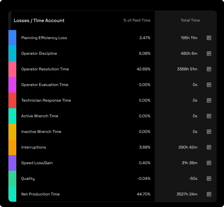
Read left to right as a loss waterfall. It breaks every minute of paid time into its categories, planning, operator discipline, the response phases, interruptions, speed, quality, ending in Net Production Time. It always sums to 100% of paid time, so one glance shows your single biggest band, which is your biggest lever.

2.3 · Key Performance Indicators
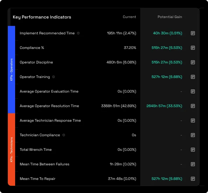
Two rails, Operators and Technicians. Each row shows a Current value and a Potential Gain, the recoverable time, with a detail button. Scan the Potential Gain column and you have your ROI ranking; the largest gain is where to start.
| Rail | Rows |
|---|---|
| Operators | Implement Recommended Time · Compliance % · Operator Discipline · Operator Training · Average Operator Evaluation Time · Average Operator Resolution Time |
| Technicians | Average Technician Response Time · Technician Compliance · Total Wrench Time · MTBF (reliability) · MTTR (repair speed) |
2.4 · Losses / Time Account
The same account as a list, each category with its % of paid time and its total time. It's the mirror of the KPI panel: the same seconds counted once as a loss category (which phase used them) and again as a KPI (how far from benchmark).
2.5 · Detail views
Every KPI and loss row carries a detail icon that opens a per-reason breakdown, allocated versus recommended versus typical, per stop reason and per operator, paginated to the top contributors. This is where the report becomes an action list: it names the stop types and the people to target. Always open them; the headline number alone under-tells the story.
3 · Use cases
- Rank where to spend. Coaching, discipline or maintenance, the Potential Gain column prices each, so you fund the biggest recoverable hours first.
- Separate the blame. The report splits planning waste, operator discipline, resolution latency and maintenance response, so a loss lands on a phase, not a person.
- Build the training case. Operator Training prices the hours you'd recover if everyone matched your best operator's proven pace, a named, defensible target, not a consultant's guess.
4 · Exports
- AI-ready (JSON). The whole priced account. Hand it to an AI assistant with a question like "which lever returns the most, and what's it worth?" More on AI and connectors →
- Excel & CSV. Any table, from the kebab menu.
5 · Good to know
Potential Gain is always a benchmark, from conservative to aspirational, Recommended (a data-driven target from your own best stops), Typical (achievable), or your best operator's pace (the training ceiling). It's the recoverable time if that metric hit that mark.
Judge on a baseline, act on the week. A single day or week can read wildly unlike the line's real character; take decisions against a three-month-plus window.
Zero technician rows mean "not captured", not "zero technician time". If your technician and wrench phases read zero, that phase isn't instrumented yet, and all resolution time lands on operators, check the capture before reading it as an operator fault.
6 · Common questions
Why is almost everything under Operator Resolution Time?
The report attributes unplanned downtime to how long it took to get running again, and resolution is usually the dominant phase. If your technician phases read zero, all of that time lands on operators, so check instrumentation before reading it as operator fault.
What exactly is Potential Gain?
The production time you'd recover if a metric hit its benchmark. It's always the recovery, never a penalty, which is why it reads as the ROI column.
Why are the technician rows zero?
That phase isn't instrumented for the line yet. Zero means "no data", not "completed instantly". If technicians perform the repairs on this line, the Assist module can be enabled so their response and repair times are recorded separately.
The numbers differ from last week.
Window sensitivity. A single week can read very differently from the quarter. Compare like windows, and judge on a three-month-plus baseline.
What's the difference between Discipline and Compliance?
Operator Discipline measures the time variance from the allocated plan, whether time was gained or lost. Compliance % is the percentage of stops completed within the allocated plan. In short, Discipline measures the time variance, Compliance the rate of adherence.