Executive Summary
The one-screen health check for a whole site or a single line: how much paid time became good product, its OEE, where the rest went, and the reasons it stopped. It's the entry point above every other report.
1 · The purpose of this report
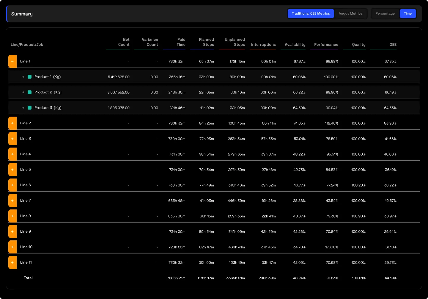
The Executive Summary answers "how did this line run, and where did the time go?" in a single view, for the plant or operations manager. You can look at a whole site, every line together, or at a single line on its own, so the same screen works for a plant manager watching the whole operation and a line owner reading just theirs. Its defining feature is that it shows the same result two ways at once: the OEE score everyone already knows (Availability × Performance × Quality), sitting next to the Augos time-loss waterfall (Paid Time − Planned − Unplanned − Interruptions − Speed − Quality = Net Production Time). Both land on the same bottom line, so the boardroom’s OEE and the improvement team’s breakdown are the same number told two ways.
2 · On the page
Top to bottom: the controls, then the summary table, then the Downtime Summary.
2.1 · Selectors and controls
| Control | What it does |
|---|---|
| Point selector | Choose a whole site, every line together, or a single line on its own. |
| Date selector | Presets (Today, Yesterday, Last 7 or Last 30 days) or a custom range. A Minutes / Hours / Days tab changes the bucketing, not the totals. |
| Metric toggle | Switch the table's columns between Traditional OEE (Availability × Performance × Quality) and the Augos time-loss waterfall. The same number, two lenses. |
| Percentage / Time | Show each figure as a share of paid time or as hours and minutes. Formatting only; the result doesn't move. |
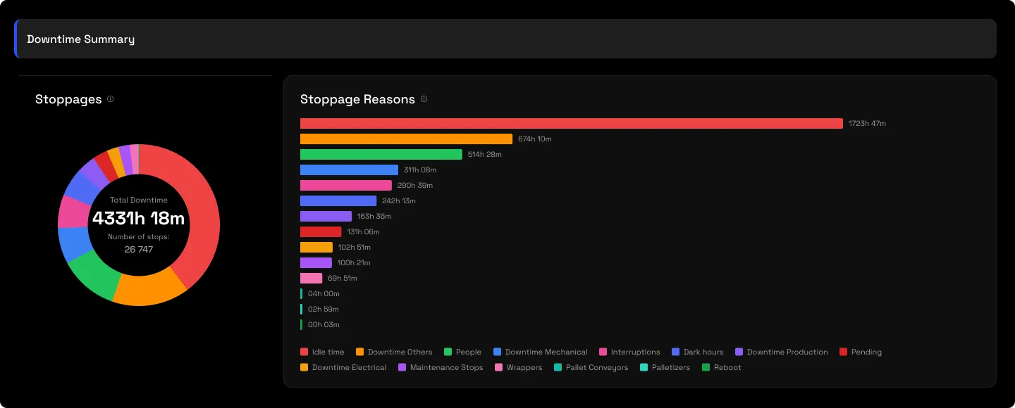
| Chart type | Draw the Stoppage Reasons chart as a ranked bar, a treemap, or a table. |
| Three-dot menu | Download the screen to Excel, or export the AI-Ready File (Beta) payload for downstream or AI tooling. |
2.2 · The summary table
The whole loss account in one row. Paid Time is the 100% base, then the split runs across it: Planned stops, Unplanned stops, Interruptions, Effective Runtime, Speed loss (or gain), Variance, and Net Production Time at the end, with the production counts, Actual and Net, alongside the times. Every row expands with a + into a per-product or per-job drill-down, and a Total row sums the line. The line-level number can be an allocation artefact, machine time sitting against no job, so the rule is never to read it without expanding.
2.3 · The Downtime Summary
Below the table, the stops themselves. A Stoppages donut gives the total downtime and the number of stops; the ranked Stoppage Reasons chart lays the reason tree out as a Pareto, biggest cause first. A large "Pending" band here is unclassified downtime, and clearing it is the first job before any tuning.
3 · Use cases
- Daily triage. A high Unplanned bucket routes you to the stoppage reports; low Performance to speed; low Quality to reject; a big Pending bar to classification, first.
- Board reporting. One number on a 30-day view, in the OEE language leadership already knows.
4 · Good to know
"Pending" is measured downtime with no reason assigned yet, surfaced rather than hidden. A near-zero OEE is usually real, not a broken report: if a line barely ran, Availability multiplies through. Always check the drill-down before concluding anything.
5 · Common questions
Our OEE can't be that low.
If the line barely ran, it can be. The report shows the maths, and the per-product drill-down shows whether it's a real loss or unassigned machine time.
We already have OEE.
You have the factor. This reconciles it against a time waterfall and hands each bucket to the report that fixes it.