Unplanned Stoppage Analysis
The reason-level diagnostic for the stops nobody chose, faults, breakdowns and waiting. It turns "the line keeps breaking" into "this machine, this fault, this many recoverable hours."
1 · The purpose of this report
Unplanned stops are measured on response: the loss is not the fault itself but the time to get running again. So the report decomposes every stop into its five phases and prices the recoverable time against a benchmark drawn from this line's own best stops, potential based on actual.
2 · On the page
Top to bottom: the filter bar, then the six tabs. Each section is broken out below with the element it draws.
2.1 · The filter bar
| Control | What it does |
|---|---|
| Reason level 1 / 2 / 3 | Three cascading dropdowns that drill from a broad reason down to a specific machine. This is how you move through the reason tree. |
| Stoppage Type | Switch between Non-Outlier (the default), Outlier and All stops. It materially changes every figure, so only ever compare like with like. |
| Year / Month, Reset | Narrow the period, or clear the drill and filters back to the whole bucket. |
Whatever you drill to is held in the URL, so any view is shareable. Each site configures its own stoppage hierarchy, so drilling down resolves a broad category toward a specific area and machine, and gives you reliability (MTBF and MTTR) down to the component. A large catch-all category is often worth investigating further, it usually hides the biggest single finding.
2.2 · The Stoppage Reasons chart
A ranked bar (or treemap) of the reasons at the current level, biggest cause first. At the deepest level it becomes a per-stop scatter with the benchmark reference lines drawn on.
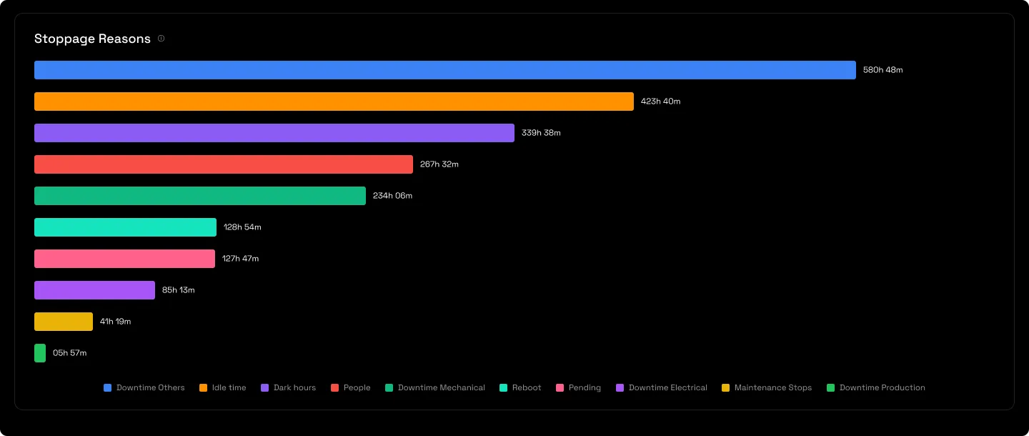
2.3 · The headline tiles
Eight tiles: Downtime, MTBF and stops-per-day, average stop time with and without assist, and each response phase with its time lost above benchmark.
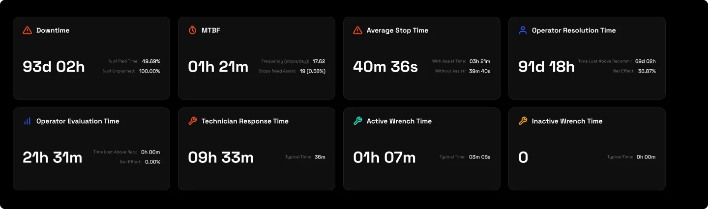
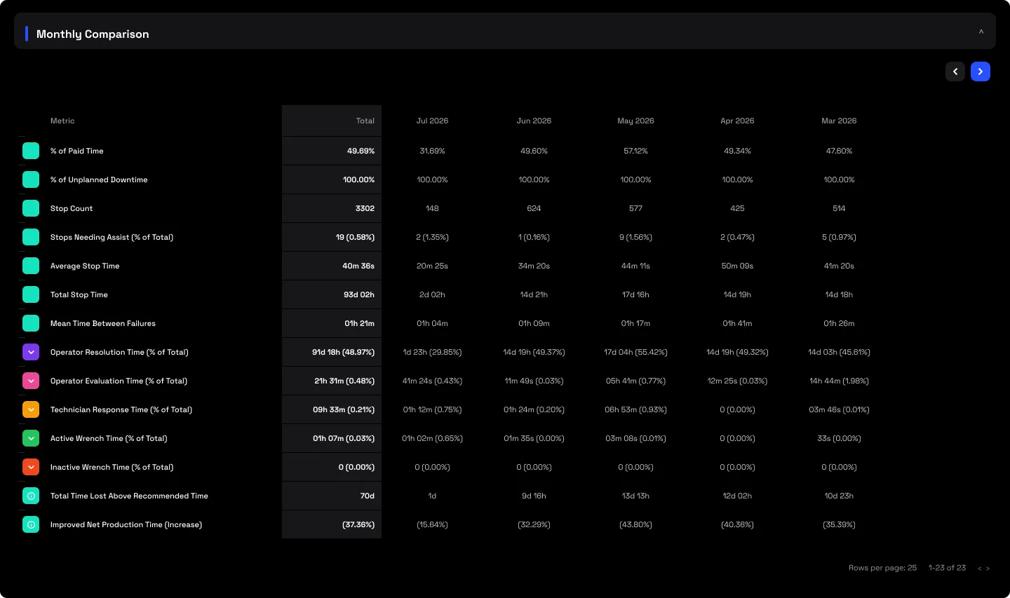
2.4 · Monthly Comparison
The same figures laid out month by month, with expandable phase rows and the recoverable-time trend, so you can see whether a reason is getting better or worse.
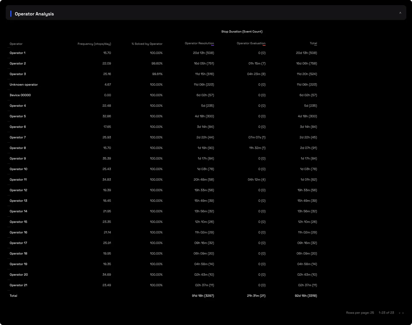
2.5 · Operator Analysis table
The same stops scored per operator, split into resolution and evaluation time, with a "% solved by operator" self-resolution rate and each operator's event counts.
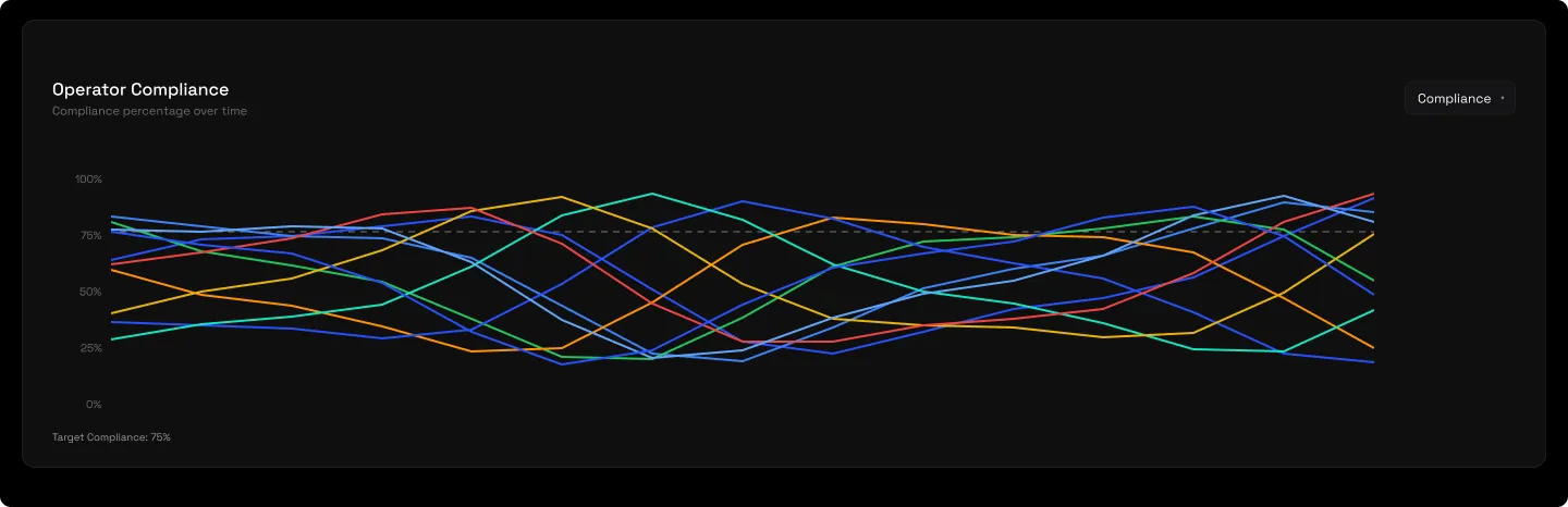
2.6 · Operator stop frequency
Stop frequency and self-resolution per operator across the period.
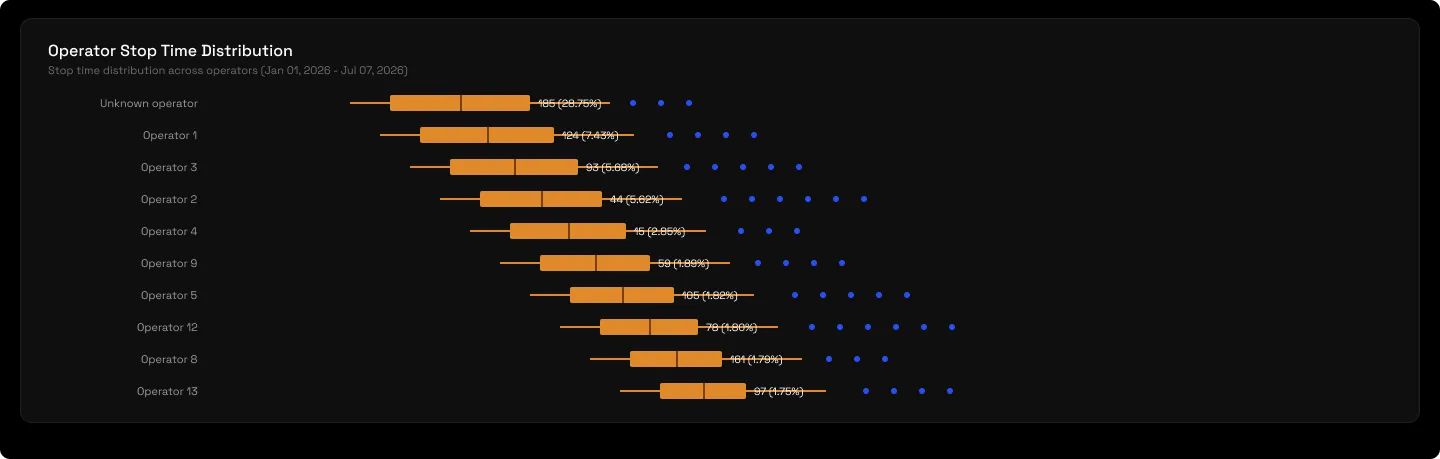
2.7 · Operator stop-time distribution
Every stop by count and duration per operator, to separate the chronically slow from the occasionally disastrous.
2.8 · Technician Analysis
Only the stops that needed a technician, response and wrench-time boxplots, for when assisted stops are dragging the average up.
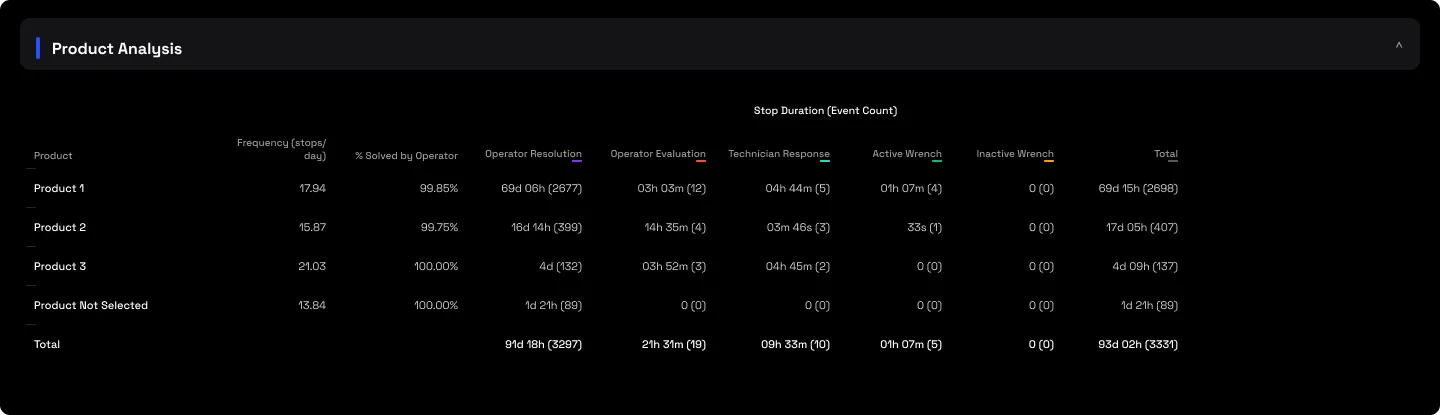
2.9 · Product Analysis table
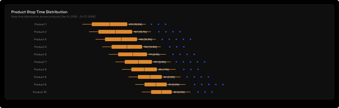
The same stops scored per product, which exposes a fault that only shows up on a particular product.
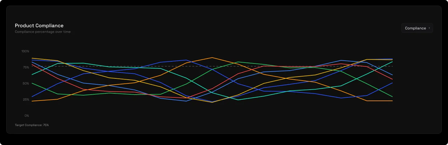
2.10 · Product stop frequency
Stop frequency per product across the period.
2.11 · Product stop-time distribution
Every stop by count and duration per product.
2.12 · Event Details
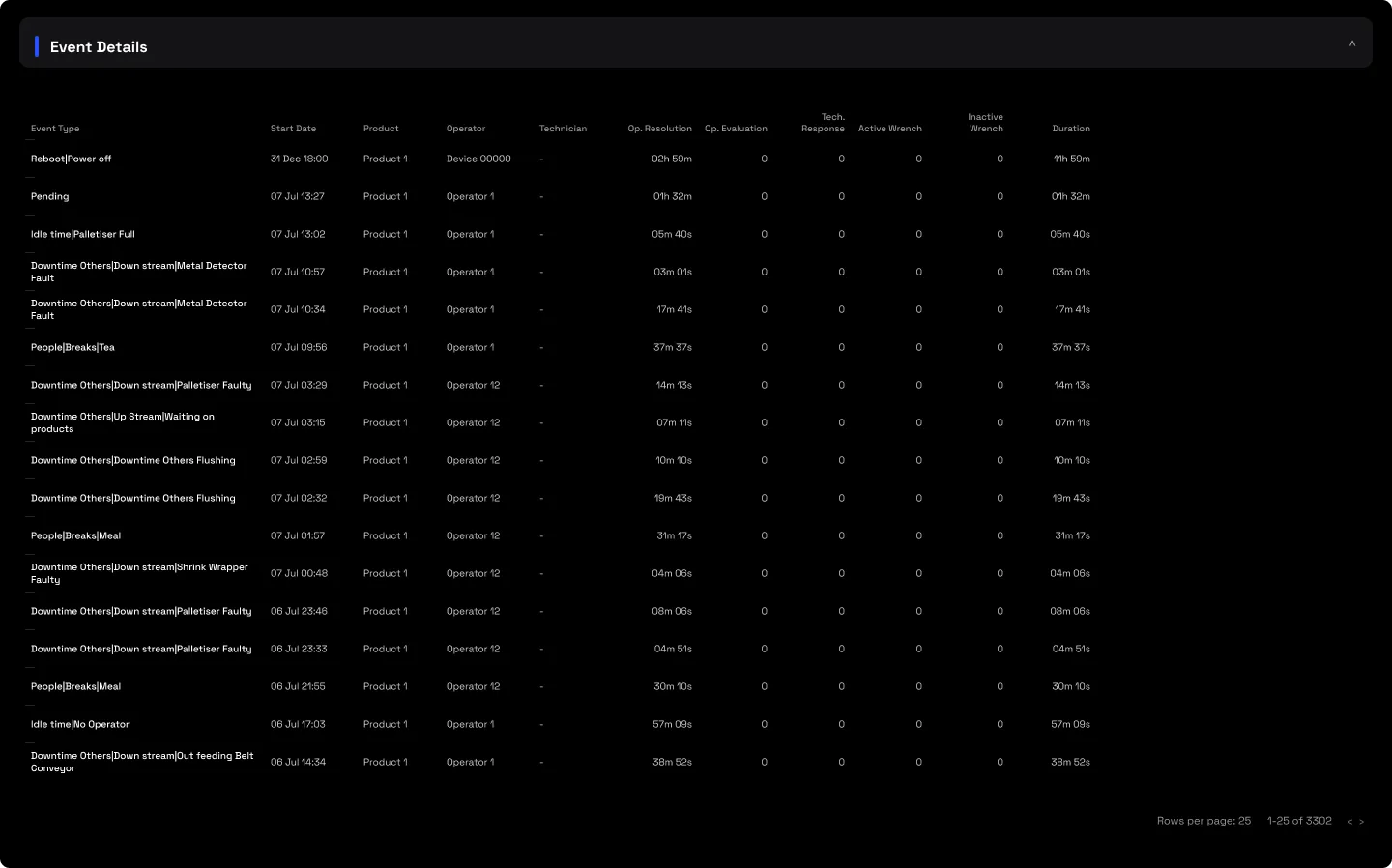
Every individual stop, with its phases, the technicians involved and the operator's note, the atomic audit trail everything else sums back to. On an assisted stop the technician response and wrench phases appear here alongside the operator's, so a fully-instrumented stop shows the whole chain end to end.
3 · Use cases
- Find the real culprit. Drill the biggest reason to equipment level; a generic "Others" bucket often resolves to a single machine that's quietly bottlenecking the line.
- Right-size the fix. The distributions show whether losses are a few long outliers to catch or chronic short stops to shave. Most lines are the former, so the fix is outlier-catching, not routine-trimming.
- Catch product-specific faults. The product cut exposes a fault that only appears on one product, a sealing or glue problem tied to a single SKU rather than the machine in general.
- Rank the training queue. The operator boxplots surface the "usually fast, occasionally disastrous" pattern and name the best median as the achievable pace to coach the rest towards.
4 · Good to know
Non-Outlier is the on-screen default; exports include all stops, so only compare figures in the same mode. Recommended times can read low at the top level because they combine many different reasons, drill into a specific reason before using one as a benchmark. Assisted stops typically take much longer than self-resolved ones, so a rising assist count is worth investigating. "Dark hours" is time outside paid production, when no shift or run is scheduled, it isn't a gap to clear. "Pending" is production time still to be classified before the downtime picture is complete.
5 · Common questions
Faster repairs need more technicians.
Usually not: on a typical line only a fraction of a percent of stops need a technician at all. The recoverable time is mostly in operator resolution latency, priced against your own proven pace, not in the wrench.
We already know why the line stops.
The biggest single equipment loss is often buried inside a generic reason, visible only three drill-levels down. The report exists to surface exactly that.
Which benchmark is which?
Recommended is the data-driven target from your own best non-outlier stops; Typical is an achievable middle; best-operator is the training ceiling, a named colleague's actual pace. They're separate numbers with separate recoverable gains, so don't read one as another.
The numbers changed unexpectedly.
Check the Stoppage Type filter, Non-Outlier, Outlier and All give materially different figures. Compare like with like, on the same point and period.
This doesn't match the Downtime Report.
It should, in all-stops mode for the same point and period. The phase totals roll up into Performance Overview, and the reason tree reconciles to the Downtime ledger event for event.