Shift Report
The per-shift handover view. It slices the same production and downtime data by shift boundary, so an incoming crew sees exactly what happened on the previous one.
1 · The purpose of this report
It's the handover cut of the one loss account: same events, partitioned by shift. It turns a period-level OEE into "which shifts are dragging the average," and pairs naturally with Operator Analysis (who) and the Downtime Report (why).
2 · On the page
Top to bottom: the controls, then four views of a single shift, bounded by the site's shift map rather than the 24-hour clock.
2.1 · Selectors
| Control | What it does |
|---|---|
| Point selector | Choose the site or line, then the shift you want to hand over. |
| Date selector | Best set to the day or week of the handover; a long window yields a very long schedule. |
2.2 · The shift schedule and timeline
The shift pattern and its interval entries, so the report starts and ends where the crew's shift did.

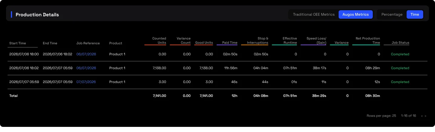
2.3 · Production details
Per product or job, exactly what the shift made, tying to the same products you'd see in the Executive Summary drill-down.
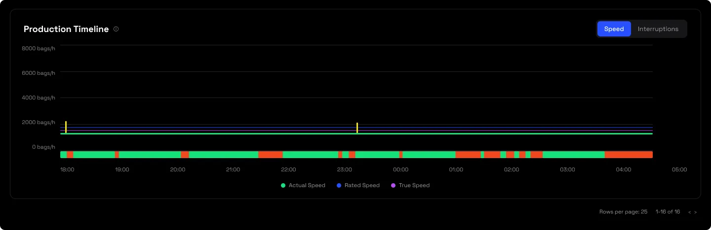
2.4 · The shift chart
A visual summary of the shift's run and its losses at a glance.
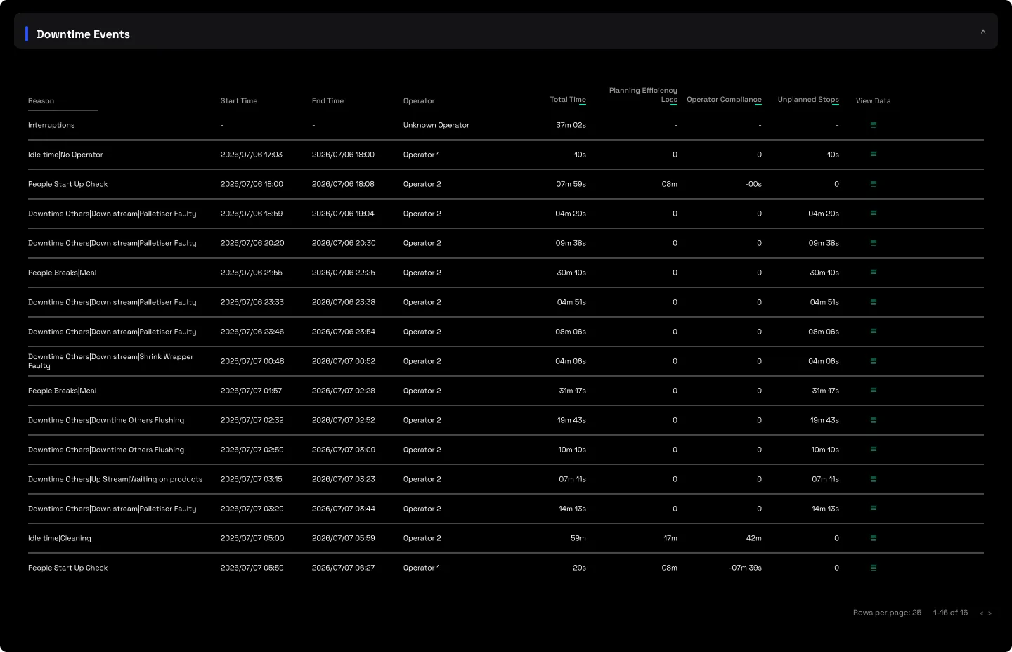
2.5 · The downtime events
The shift's stops, the same events as the Downtime Report filtered to the shift, so "what stopped us" sits on the same screen as "what we made".
3 · Use cases
- The morning meeting, pre-built. One screen shows last shift's output, its stops and its context, no verbal-handover loss.
- Fair crew comparison. Cross-shift performance becomes a data conversation, not anecdote.
- Pin a bad night. A shift with poor uptime stands out immediately, and pairs with Operator Analysis for who and the Downtime Report for why.
4 · Good to know
The Shift Report reflects a single shift only, you can't consolidate several shifts into one view. To see trends across shifts or days, compare several Shift Reports side by side, which also shows whether an issue is isolated or recurring. Confirm the configured shift boundaries match the site's actual pattern before comparing crews, a mismatch there is the usual reason shift totals don't line up with the daily reports.
5 · Common questions
Shift totals don't match the daily reports.
Almost always the shift-boundary configuration. It's the same point and the same events, only the partition differs, so aligning the boundaries reconciles them.
The schedule is enormous.
Expected on a long window. Narrow to the day or week of the handover you're actually reading.