Planned Stoppage Analysis
The reason-level diagnostic for scheduled stops: cleaning, changeovers, planned maintenance. Where unplanned stops are measured on response, planned stops are measured on adherence.
1 · The purpose of this report
A planned stop was chosen, so the loss is over-running it. The report scores three things: compliance (actual vs the allocated allowance), potential gain (actual vs the recommended best-actual), and consistency (the coefficient of variation, an erratic task is a loss even at a good average). Aggregated, the compliance loss is the Operator Discipline figure you see on Performance Overview.
2 · On the page
Top to bottom: the filter bar, the benchmarks each stop is scored against, then whichever of the seven tabs you're reading.
2.1 · The filter bar
| Control | What it does |
|---|---|
| Reason level 1 / 2 / 3 | Three cascading dropdowns that drill from a broad reason (say Changeover) down to a single task (a specific setting). |
| Stoppage Type | Switch between Non-Outlier (the default), Outlier and All stops. It materially changes every figure, so only ever compare like with like. |
| Year / Month, Reset | Narrow the period, or clear the drill and filters back to the whole bucket. |
The drill path lives in the URL, so any view is shareable.
2.2 · The four benchmarks
Every planned stop is scored against up to four yardsticks:
| Benchmark | What it is |
|---|---|
| Allocated | The scheduled allowance, set in Setup. Staying inside it is compliance; time above it is Operator Discipline. The primary planned yardstick. |
| Recommended | The best-actual target, computed from your own line's fastest non-outlier stops. The source of the priced potential gain. |
| Typical | A realistic benchmark drawn from actual performance, half of all recorded stops finished in this time or less. |
| Maximum threshold | The upper bound beyond which a stop is treated as an outlier. |
2.3 · The Stoppage Reasons chart
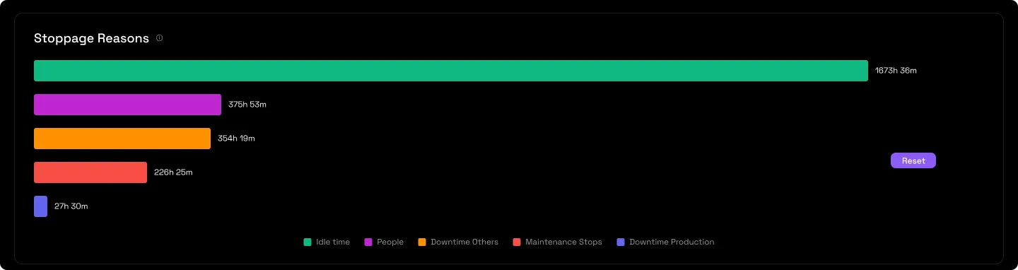
A ranked bar (or treemap) of the reasons at the current level, biggest cause first. At a single task the chart becomes a per-event scatter with the benchmark lines drawn on.
2.4 · The summary tiles
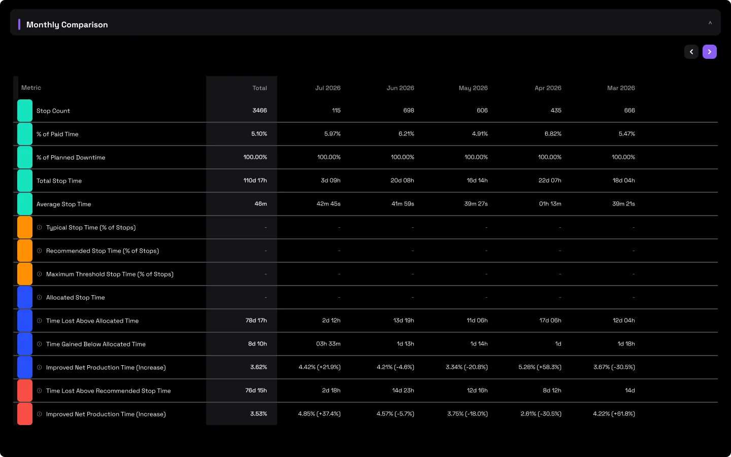
Percent of paid time and total stop time, with time lost above the allocated (compliance) and recommended (potential gain) benchmarks.

2.5 · Monthly Comparison
The tiles recomputed month by month, with the benchmark and recoverable-time trend rows, so you can tie an improvement to a month and see whether it held.
2.6 · Operator Analysis table
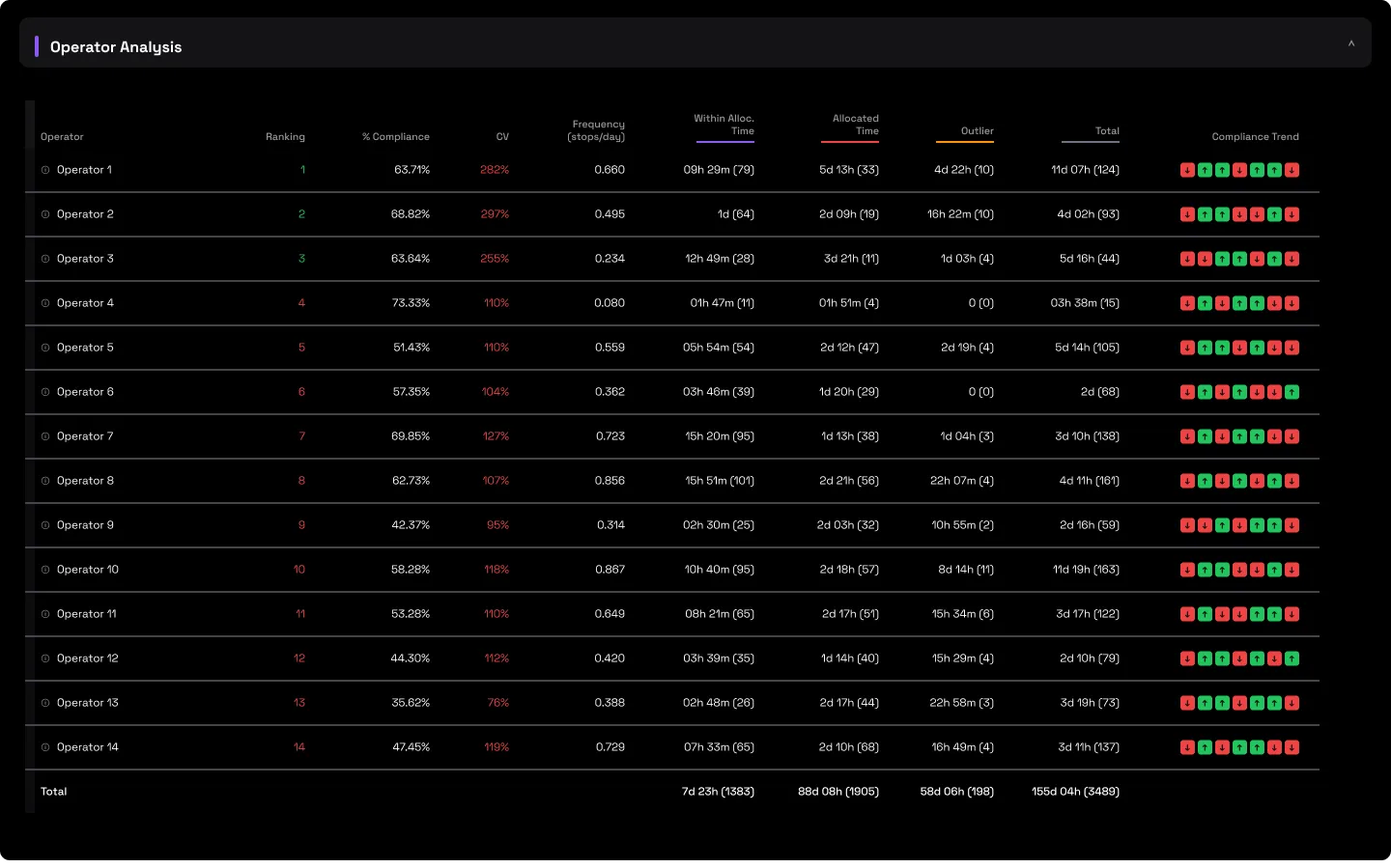
A ranked table per operator: compliance %, consistency (CV), frequency, and stop time split into within-allocated, exceeding and outlier.
2.7 · Operator compliance chart
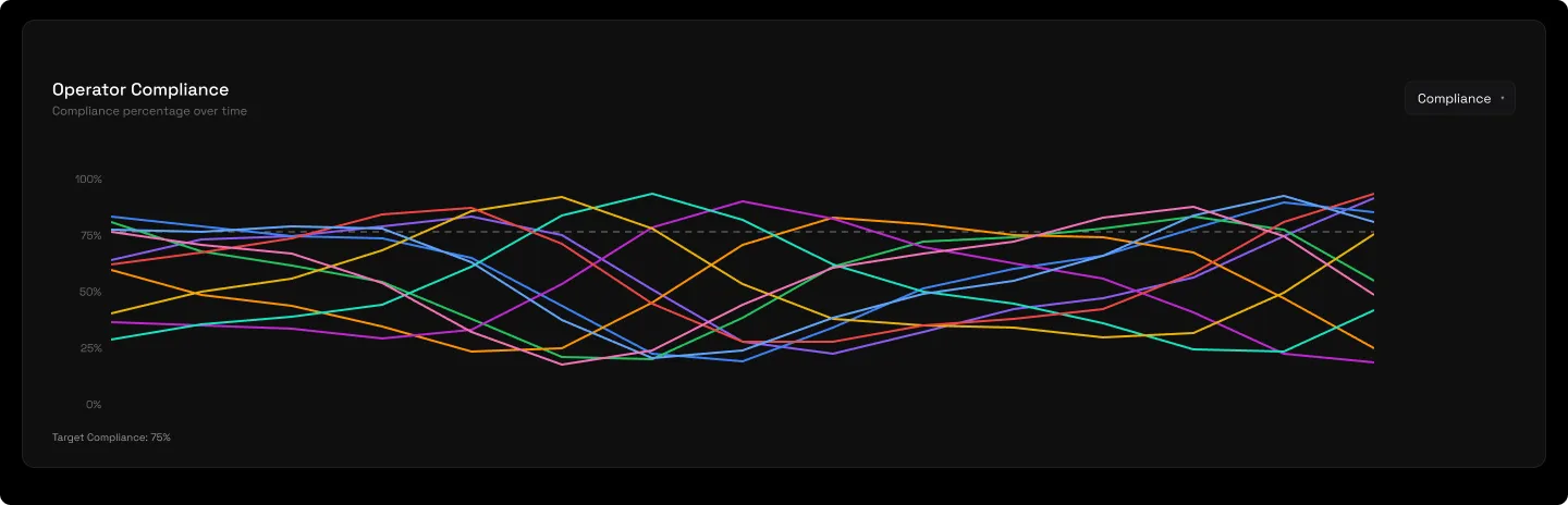
Each operator's compliance trend against the 75% target line.
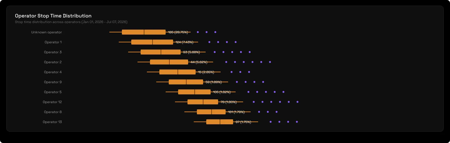
2.8 · Operator stop-time distribution
Every stop as a point coloured by operator, against the Allocated (green) and Recommended (red) lines. Every point above the red line is a dated, operator-attributed stop that ran long, so you can see exactly who to coach and when it slipped.
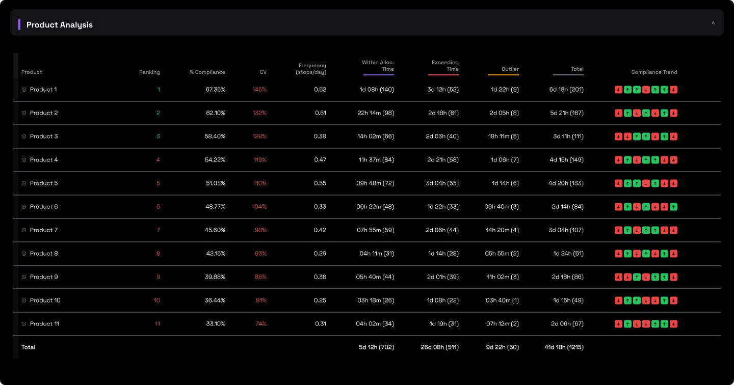
2.9 · Product Analysis table
The same scoring dimensioned by product, which exposes product-specific changeover and cleaning inefficiencies and feeds sequencing decisions.
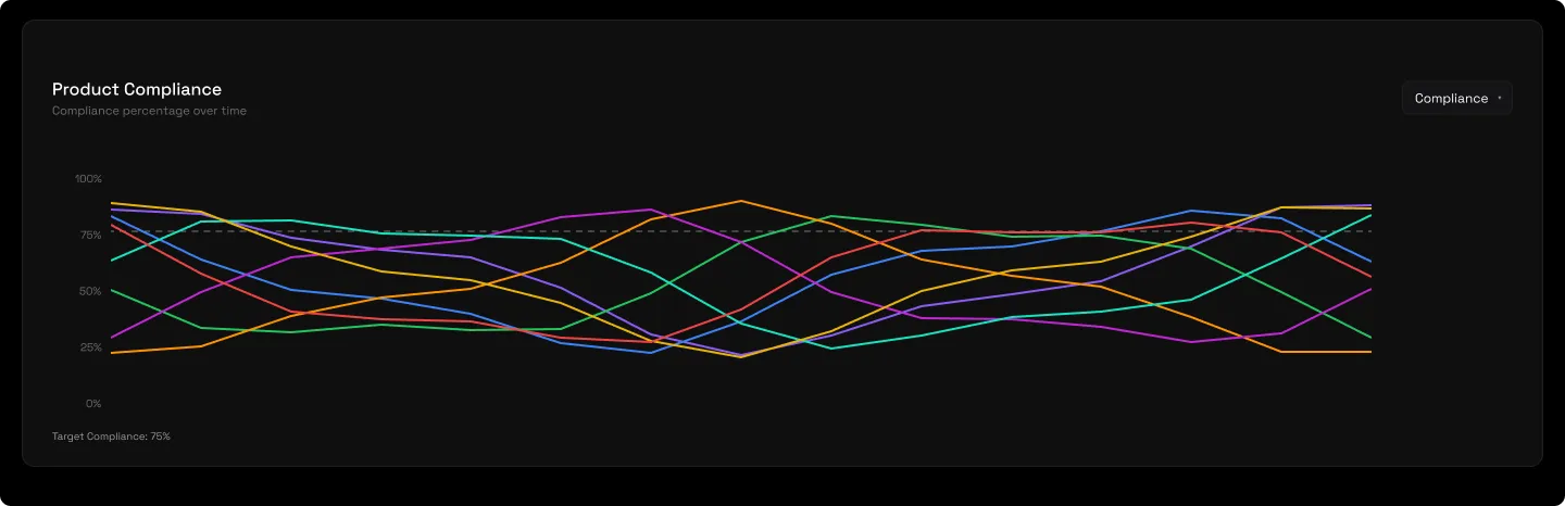
2.10 · Product compliance chart
Each product's compliance against the target line.
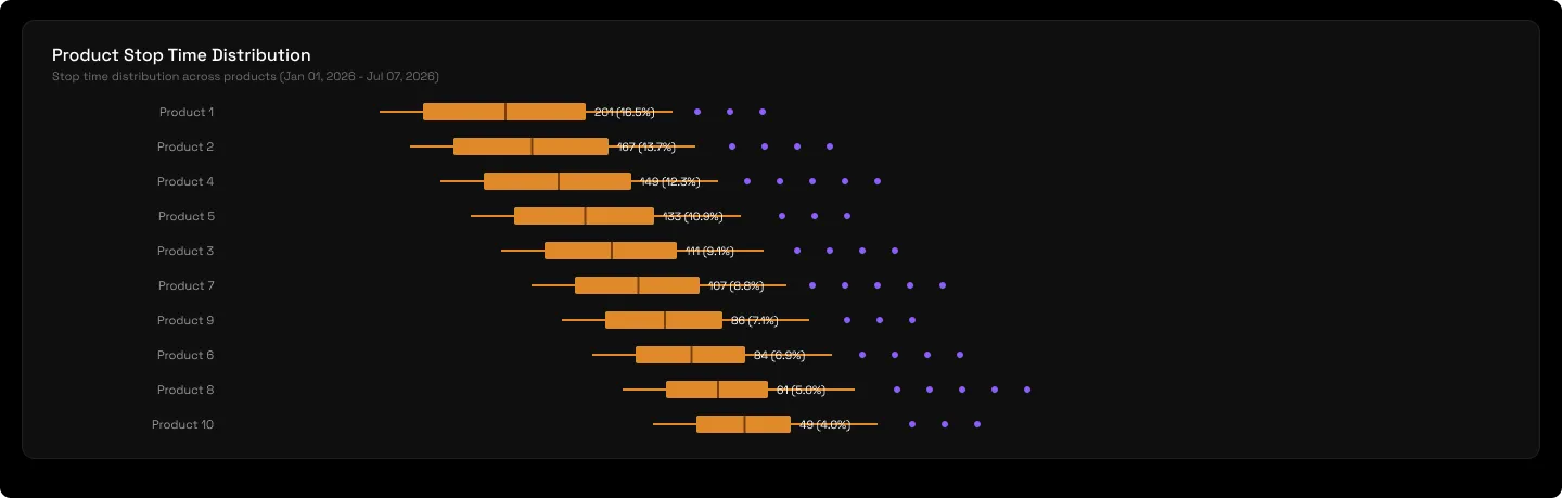
2.11 · Product stop-time distribution
The per-product scatter against the benchmark lines.
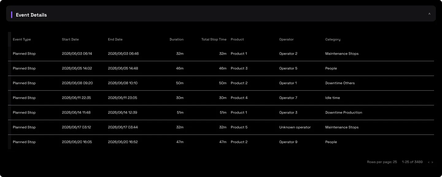
2.12 · Event Details
Every individual stop, start, end, duration, reason path, operator, product and note. The audit trail everything reconciles to.
3 · Use cases
- Re-baseline a changeover. If the allocated time is looser than the line's proven best, the gap between them is a training opportunity, the plan itself is slower than what someone has already achieved.
- Coach the erratic, not just the slow. The coefficient of variation catches tasks that swing wildly even when the average looks fine, an unschedulable task is a loss before the average is even addressed.
- Sequence production better. The product cut shows which products carry the heaviest changeover and cleaning load, so you can order runs to minimise it.
- Prove discipline at source. The compliance loss this report computes per task and per operator is the exact Operator Discipline figure an ops director sees on Performance Overview, an unbroken drill from a boardroom KPI to a named, dated stop.
4 · Good to know
Which reasons count as "planned" is per-point Setup, so the reason list differs between lines, and the Allocated allowance is set there too. Non-outlier is the fairest view for coaching; switch to outlier to hunt the rare disasters separately, and note the on-screen non-outlier default reads smaller than an all-stops export. A benchmark cell showing "–" means no target is set for that reason yet, not zero. And judge on a baseline, act on the week: a single day or week can read wildly unlike the line's real character, so take decisions on a three-month-plus window.
5 · Common questions
Planned stops are scheduled, they aren't a loss.
The schedule is a cost you chose; over-running it is a loss you didn't. That over-run is exactly the Operator Discipline number.
Targets from consultants never stick.
These aren't consultant targets. Recommended time is computed from your own line's best stops, someone on your team already hits it.
The numbers changed unexpectedly.
Check the Stoppage Type filter. Non-Outlier, Outlier and All give materially different figures, the same reason can read less than half in one mode versus another. Compare like with like.
Why is the Recommended time so low?
It's the best-actual target from your fastest non-outlier stops, so it's meant to be tight. At a single task it's realistic; at the top level it can look extreme because it blends many reasons together.
This doesn't match the Downtime Report.
It should, in all-stops mode for the same point and period. The reason tree reconciles to the Downtime ledger event for event, and the compliance loss rolls up to Operator Discipline.