Charting.
Plot any reading over any period, compare sensors, and save the views your team keeps coming back to.
1 · What it is for
Charting is where you ask your own question of the data. Plot any parameter from any sensor over any period, overlay several to compare them, and read exact values off the line. It works the same on sensing data as on energy and production data, so a single tool covers every measurement Augos holds.
2 · On the page
2.1 · Choose points and metrics
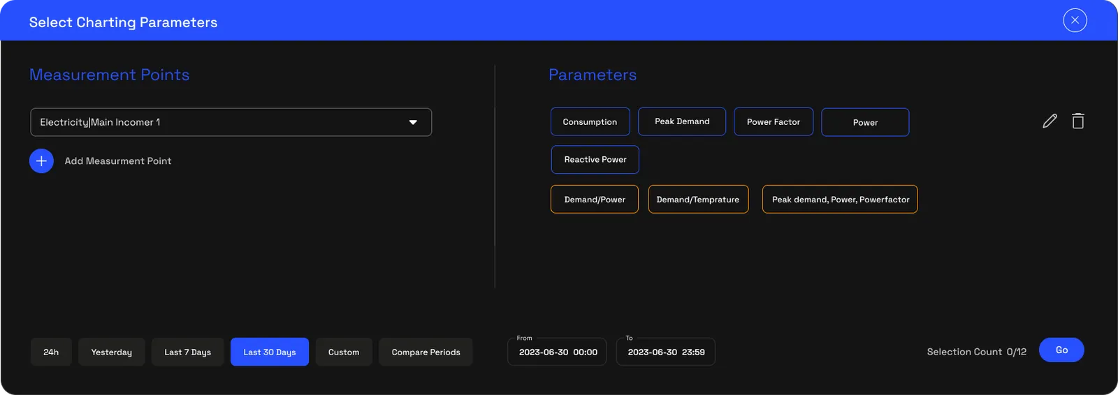
Pick one or more measurement points and the metric to plot. Add more than one to overlay them on the same view and compare, two cold stores against each other, or temperature against humidity for the same room.
2.2 · Period and resolution
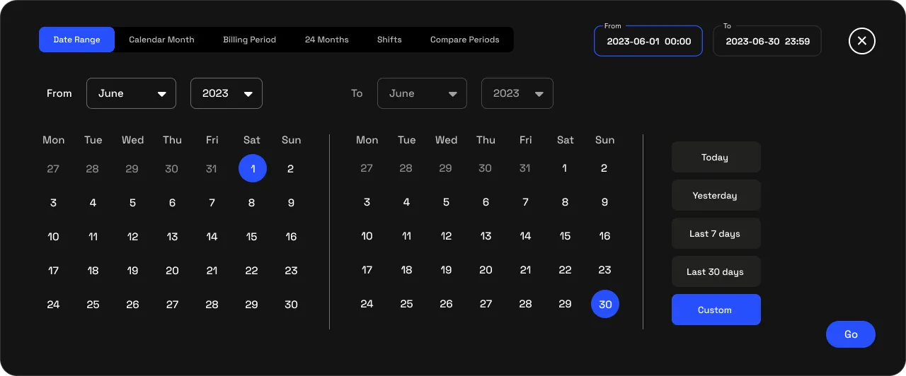
Set any date range and choose the resolution. Fine one and five-minute detail is there for diagnostics; coarser intervals show the long-run shape. The platform holds every reading between reports, so the trend stays continuous.
2.3 · Read and save
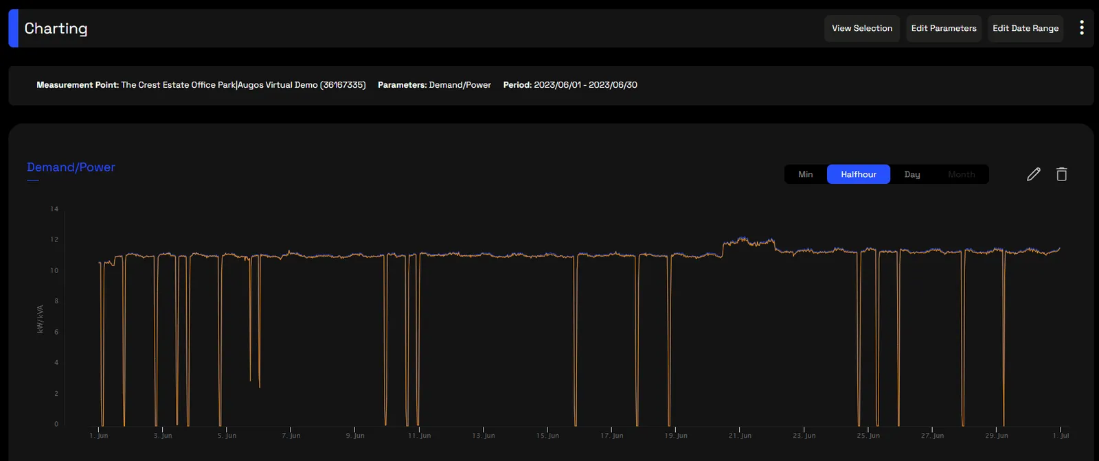
Hover to read exact values off the line, zoom into a window, and save the charts your team returns to, so a view you built is one click away next time rather than rebuilt each visit.
3 · Use cases
- Compare two points. Put two stores, tanks or rooms on one view to see which runs hotter, fuller or wetter.
- Correlate two readings. Overlay temperature and a door’s state to see a warm-up follow every opening.
- Find the pattern. Plot a week or a season to see the daily rhythm and the outliers.
- Check a fix held. Chart the days before and after a change to confirm it worked.
- Build a report chart. Save the view and export it for a pack or a review.
4 · Exports
- CSV & Excel, the charted data at your chosen resolution, via Data download.
- AI-ready (JSON), the same series for a model; see AI-ready data.
5 · Good to know
Charting is for exploring and comparing, not for notifying, that is Triggers and alerts, or for the compliance roll-up, that is the dashboards. One tool spans every pillar, so the same chart works on sensing, energy and production data, and it is scoped to your access.
Common questions
Can I compare several sensors?
Yes. Overlay as many points as you need on one view to compare them directly.
What resolution can I plot?
From one-minute detail up to coarser intervals, depending on how finely you want to see change.
Can I save a chart?
Yes. Save the views your team returns to so they are one click away.
Does it cover energy too?
Yes. Charting is shared across pillars, so one tool plots every measurement Augos holds.