Power factor & demand
1 · The purpose of this report
Power factor is a lever on your demand charge. Demand is billed on apparent power (kVA), and power factor is how much of that kVA is doing real work, kW over kVA. When inductive equipment like motors and transformers runs at part load, the power factor drops and the kVA inflates, so your demand and the demand-based charges climb even though the useful power hasn't changed. This report finds the half-hour that set each month's peak demand, works out the power factor there, and puts a rand figure on what the poor power factor added to that charge.
It also sizes the fix. From the same data it works out the capacitor correction, in kVAr, needed to lift your power factor to unity, or close to it at around 0.99. That kVAr figure is what an engineer or a power factor correction supplier needs to quote the equipment.
2 · On the page
Pick a site and a 24-month window: the trend chart up top, the headline tiles, the per-incomer contribution, then the performance table.
2.1 · Selectors and menu
| Control | What it does |
|---|---|
| Point selector | Any site or billing point you have access to. |
| Date selector | Any 24-month period since measurement was installed at the site. |
| Three-dot menu | Open the data-download window, or view the tariff scheme loaded to the point. |
2.2 · The demand and power factor chart
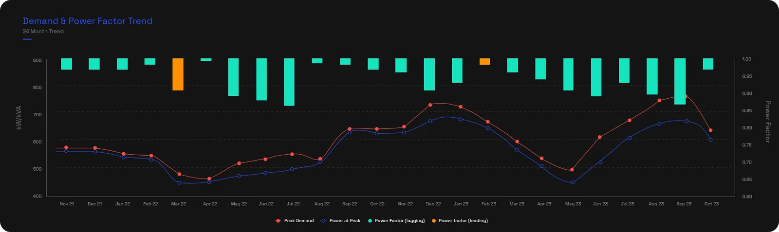
The trend chart sets demand and power factor side by side over 24 months. The red line is your peak demand (kVA) and the blue line the real power at that peak (kW); the bars are the power factor each month. Teal bars are a lagging power factor, the usual inductive case; orange bars are leading, which means a power factor correction system is over-pushing reactive power. Hover a month for the exact figures, including the reactive power at the peak.
2.3 · The tiles
Four tiles run across the top, left to right:
- Actual loss is the extra demand cost poor power factor added over the period.
- Potential loss, for sites with several incomers, is what you'd have paid if each incomer's worst peak had landed at the same moment.
- Power factor performance shows the power factor at peak over the last 30 days, with the peak demand beside it.
- The dynamic PFC tile tells you whether the correction is keeping up: Under capacity with the kVAr shortfall when it isn't, or a PFC service due, with a button to book a survey.

2.4 · Main point contribution
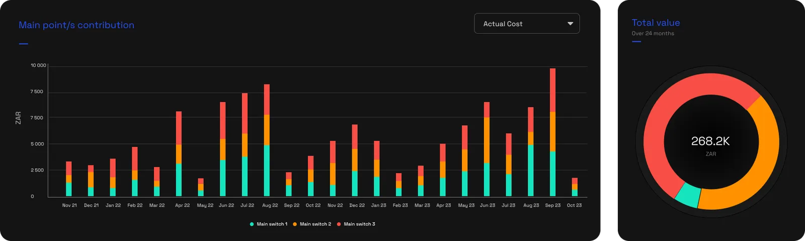
For a site fed by more than one incomer, the contribution charts split the load across them, by actual cost, demand or reactive power, and the potential figures too. A bar chart tracks each incomer month by month, and a donut shows the 24-month split. It's how you see which board is driving the penalty.
2.5 · The performance table
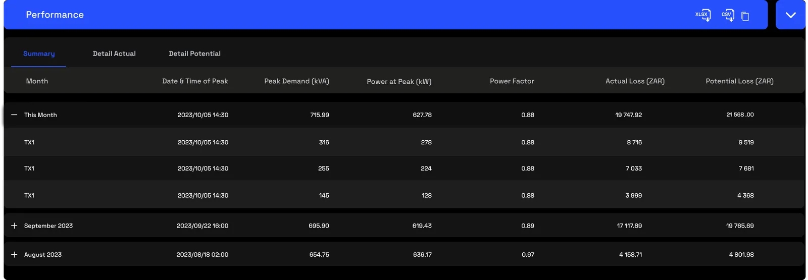
The performance table is the detail, in three views:
- Summary gives one row per month: the date and time of the peak to the half-hour, the peak demand, power at peak, power factor, and both losses.
- Detail actual breaks each month down to the incomer, with the demand-based cost, the corrected cost, and the actual saving available.
- Detail potential does the same for the worst-case timing exposure, showing the potential saving available.
You can drill from the billing point to each incomer, and export any view to Excel or CSV.
3 · Use cases
- Build the case for a power factor correction system. Actual loss is the annual cost; divide a quote for the power factor correction system by it and you have a payback period, and the under-capacity kVAr sizes the equipment.
- Catch a failing power factor correction system. A power factor that drifts down over the trend means the power factor correction system isn't holding. A Trigger can flag it before the next bill rather than waiting for the penalty to reappear.
- Spot a stuck contactor. Power factor that's fine under load but goes leading at low load often means a capacitor contactor stuck closed, pushing reactive power with nothing to absorb it.
- Keep a compliance record. The 24-month trend and the peak calendar are an exportable history of power-factor performance for a utility dispute or a compliance file.
4 · Exports
- AI-ready (JSON). The power-factor profile with peak demand, actual and potential loss and the under-capacity kVAr, plus guidance for sizing a power factor correction system. Hand it to an AI agent with a vendor quote and ask for the payback period. More on AI-ready data →
- Excel & CSV. Any view of the performance table, from the icons in the blue bar. More on data download →
5 · Good to know
Power factor is real power divided by apparent power, kW over kVA, and 1.00 is ideal. Any power factor below 1.00 inflates your kVA, and with it your demand and the demand-based charges that ride on it, so the closer to unity you run, the less you pay. That's why the fix targets unity, not just an acceptable number.
Both directions are penalised, lagging from too little correction and leading from too much. Peaks are resolved to the 30-minute interval to match how the utility bills demand.
Actual loss is what the penalty cost; Potential loss is the worst-case timing exposure on a multi-incomer site. Under capacity is the kVAr a power factor correction system would need to add, the figure to hand a supplier. Access is scoped by point, and the report pairs with Triggers to watch power factor between bills.
6 · Common questions
What's a good power factor?
1.0 is ideal, with every unit of power doing useful work. Well-corrected sites usually sit around 0.99. Below 1.0, apparent demand (kVA) rises and the demand-based charges built on it stay higher than they need to be.
Does this size my power factor correction system?
It gives you the Under Capacity (kVAr) figure, the correction needed to reach the target. That's the input your power factor correction vendor or engineer uses to specify the equipment; the report doesn't pick the kit itself.
Why is the peak measured over 30 minutes?
Because most tariffs bill demand on a 30-minute average. Matching that interval lines the analysis up with how the utility actually charges you.
What does an orange month on the trend mean?
Leading power factor, where the correction system is pushing out more reactive power than the load uses. That's over-correction, and utilities penalise it too.