Time of use
1 · The purpose of this report
Time of use shows when you used energy, not just how much. Under a time-of-use tariff the rate changes through the day and across the season: peak hours cost more than off-peak, so the same kWh is worth more or less depending on when it lands. This report sorts your consumption into those windows, standard, peak and off-peak, and shows where your load, and your cost, actually falls.
Because it lays the week out hour by hour, it also makes after-hours load visible: energy used when the site should be idle. When a site closes for the weekend the heatmap should go quiet; if it stays warm, you can see how much is still being used and go looking for the cause.
2 · On the page
Top to bottom: the controls, a consumption-against-cost split, the heatmap, a day-of-week trend, then the breakdown table.
2.1 · Selectors and menu
| Control | What it does |
|---|---|
| Point selector | Any point. A point with a time-of-use tariff shows both consumption and cost. |
| Date selector | A full calendar month, or a billing period created in Bill verification. |
| Three-dot menu | Open the data-download window, or view the tariff scheme loaded to the point. |
2.2 · Consumption against cost
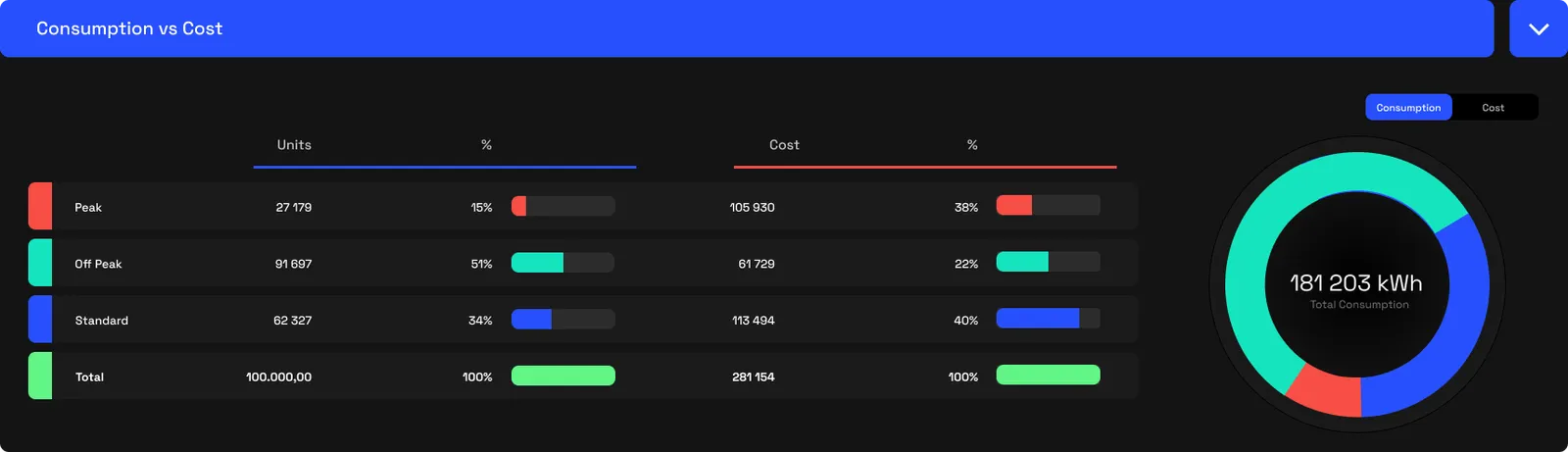
The first block splits your consumption across the three windows, as units and as cost, with a donut alongside. This is where time-of-use pricing shows its teeth: peak hours are often a small share of your kWh but a large share of your bill. Switch between consumption and cost and the peak slice swells while off-peak shrinks, which is exactly how the tariff prices them.
2.3 · The heatmap
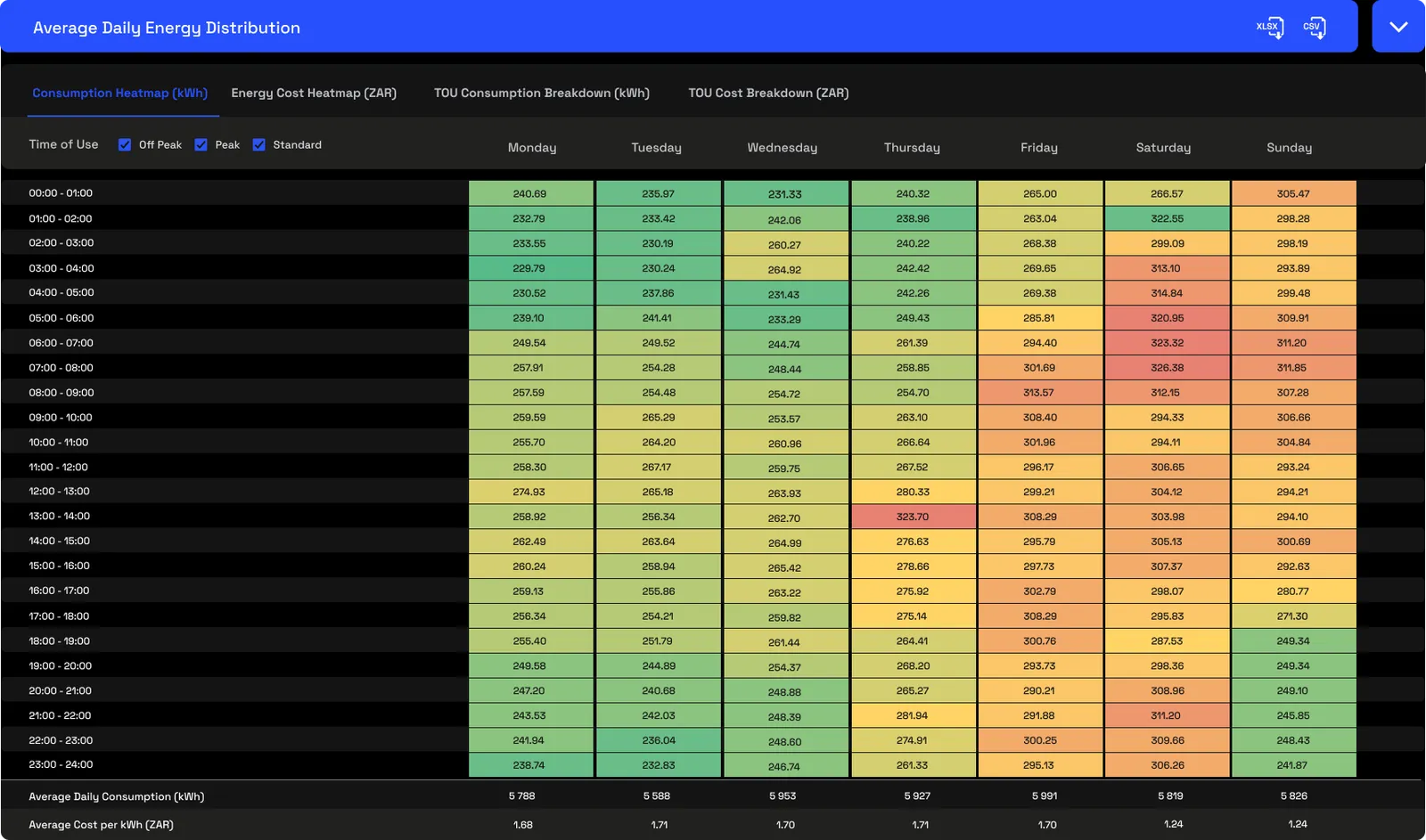
The heatmap is the heart of the report: the 24-hour day down the side, the days of the week across the top, each cell shaded from green to red by intensity, with the average daily consumption and cost totalled along the bottom. A row of tabs chooses which of four heatmaps you're looking at, and the checkboxes isolate a single tariff window so you can read one band on its own. The four views are two pairs, consumption and cost, each available plain or with the TOU windows drawn on.
2.3.1 · Consumption heatmap (kWh)
The average energy used in each half-hour of each weekday. This is where your load physically lands across the week, the shape of your operation, before any pricing is applied. A weekend that stays warm here is after-hours load.
2.3.2 · Energy cost heatmap (ZAR)
The same grid shaded by cost instead of energy. Because peak half-hours are priced higher, they glow more than their kWh alone would suggest, while off-peak load fades back. Set beside the consumption heatmap, it shows where the money goes rather than just where the energy goes.
2.3.3 · TOU consumption breakdown (kWh)
The consumption view with the tariff's peak, standard and off-peak windows drawn over it. It ties each block of load to the window it falls in, so you can see how much of the day's energy sits inside a peak window.
2.3.4 · TOU cost breakdown (ZAR)
The cost view with the same window overlay. It shows how the bill divides across the windows on the grid itself, making clear which windows, and which hours, carry the cost.
2.4 · Energy distribution trend
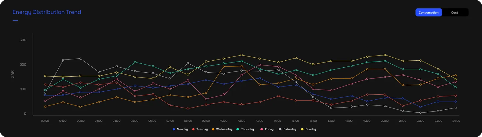
The trend chart draws one line per day of the week, each the average load shape across the 24 hours. It's the same data as the heatmap read a different way, handy for setting a Monday against a Saturday, or seeing how a day's curve lines up with the tariff windows. The toggle switches it between consumption and cost.
2.5 · The breakdown table
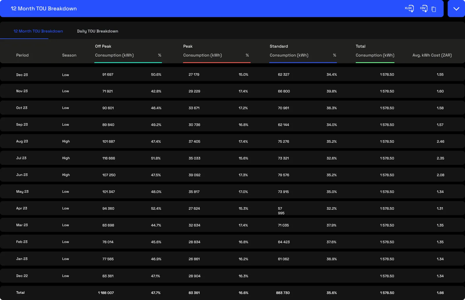
The table puts numbers to all of it. Each row, by month or by day, shows the season, the consumption in each window with its share of the total, the total, and the average cost per kWh for the period, the blended rate. Read down the seasons and you can see the same kWh costing more in high season than in low.
3 · Use cases
- Plan a load shift. The heatmap shows which loads fall in the expensive peak windows, so you can decide what's worth moving, pre-cooling, compressed air or a chiller, into off-peak. The change in blended rate then confirms the saving.
- Find after-hours load. When a closed site keeps consuming, the quiet hours light up on the heatmap. You can see how much, and chase the cause.
- See where cost concentrates by season. The breakdown table shows peak's share of cost climbing in high season, so you know which months and which windows are worth the effort.
4 · Exports
- AI-ready (JSON). The consumption and cost in each band, plus the hour-by-hour heatmap. Hand it to an AI agent with your production schedule and ask what shifting a process would save. More on AI-ready data →
- Excel, CSV & Copy table. Any of the tables, from the icons in their blue bars. More on data download →
5 · Good to know
The blended rate is simply total cost divided by total consumption: the average you actually pay per kWh across every window and season. It runs higher than the standard band rate, because peak hours carry a higher rate even when they're a minority of your kWh, and it's the right figure for budgeting and for sizing an efficiency investment.
Time of use looks at timing within your current tariff; it doesn't compare one tariff against another. For that, use Tariff comparison.
The windows and the high and low seasons come from the tariff loaded to the point. Access is scoped by point, and on a large dataset the heatmap can take a few seconds to draw.
6 · Common questions
What sets the peak window?
Your active tariff. The platform reads the peak, standard and off-peak boundaries straight from the tariff, including which hours apply and on which days.
Is the blended rate the same as my tariff rate?
No. The advertised rate is usually the standard band. The blended rate is the weighted-average cost per kWh you actually paid across every window and season, so it differs whenever your use is spread across bands priced differently.
How are high and low seasons handled?
The season boundaries and their multipliers come from the active tariff and are applied automatically in the background.