Dashboard
1 · The purpose of this report
The Dashboard gives you an executive overview of a single day's energy use. Its job is to put the day's KPIs in front of you at a glance, each set against the day before, and to make waste, savings and risks easy to spot through the chart and heatmap, all without opening another report. It shows today by default, and you can step back to any past day.
2 · On the page
Top to bottom, the page gives you a row of controls, then the executive summary tiles, then a chart paired with a heatmap, all for the day and utility you've selected.
2.1 · Selectors and indicators
| Control | What it does |
|---|---|
| Point selector | Choose a site. Only sites are selectable here; sub-points appear in the Technical Analysis table lower down the page. |
| Date selector | Pick any day since measurement was installed. The heatmap doubles as a date selector. |
| Product selector | Switch the utility: electricity, water, fuel or gas. |
| Tariff details | The three-dot menu opens the tariff scheme linked to the point. |
| Load-shedding indicator | Shows the current loadshedding stage when you're viewing the current day. |
2.2 · The KPI tiles
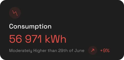
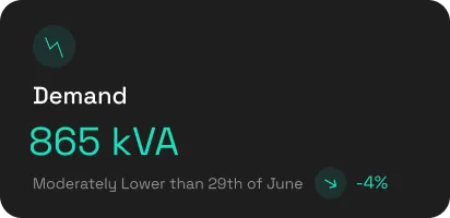
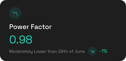
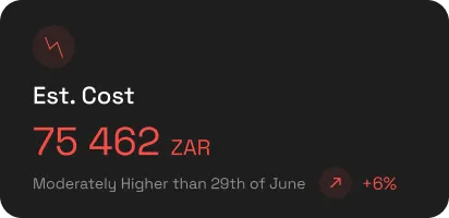
Four KPI tiles give a fast read of the day, each showing the day's value and the movement against the previous day.
| Utility | The four tiles |
|---|---|
| Electricity | Energy consumption (daily kWh), Maximum demand (daily peak kVA), Power factor (at maximum demand), Estimated cost. |
| Water, gas, fuel | Consumption, Minimum flow, Maximum flow, Estimated cost. |
2.3 · Chart and heatmap
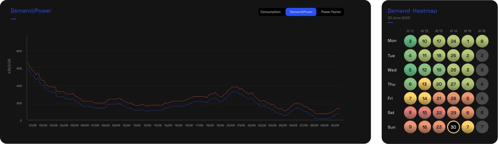
The bar chart and heatmap work together. A selector switches both between Consumption, Demand and Power Factor. The chart plots 60-second data, and where a site has sub-points the bars stack the sub-meters one level down. The heatmap shades up to six weeks of days from green to red, and clicking any day loads it. It shows where the pattern broke, so the cell that stands out from its neighbours is where you look first.
2.4 · Technical Analysis table
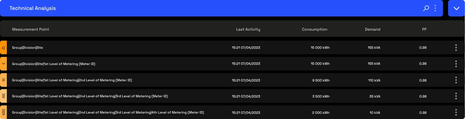
Below the chart, the Technical Analysis table lists every measurement point downstream of the one you've selected, with its last activity, consumption, demand and power factor for the day. The marker on the left shows each point's level in the hierarchy, a circle for the site, then a chevron for each level down. Click a row's level marker and it expands into one-minute charts for that point, Demand/Power, Consumption or Power Factor, which you can zoom into; a Show Statistics button opens the full metric table for that point.
2.5 · The 33-week heatmap
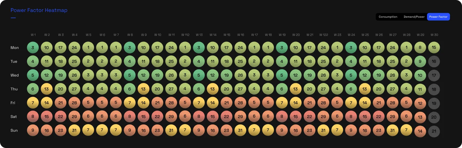
At the foot of the page, a long heatmap shows a daily view over up to 33 weeks, for consumption, demand or power factor. The colour scale runs green to red, and for power factor green is good and red is poor, so a long-run pattern or a bad stretch stands out at a glance. Like the day heatmap, clicking any day loads it.
3 · Use cases
- The morning check. See the day's consumption, demand, power factor and cost against yesterday before you do anything else.
- Catch an overnight anomaly. A hot cell on the heatmap overnight or at the weekend points to load that shouldn't be running; switch to the demand view to see it.
- Chase a spike. When a KPI tile jumps, drill from the tile into the report that explains it: cost into Cost Breakdown, demand into Power Factor.
- Validate a past day. Step back to any day to check what happened, after a production change, an outage or a complaint.
- Find your worst days. Use the 33-week heatmap to pick out the highest-consumption or worst-power-factor days over months, then open them.
- Glance across utilities. Switch between electricity, water, gas and fuel to read each one's day with the same framing.
- See which points drove it. Use the Technical Analysis table to find the downstream points behind the day's totals.
4 · Exports
- AI-ready (JSON) — a structured, flattened export with the labels, units and source already in the file, so an AI agent can read and reason over the day's data directly, without anyone reformatting it first. Pull it from the export banner; more under AI-ready data & exports.
- CSV & Excel — raw data at any resolution, via Data download.
5 · Good to know
The Dashboard's data updates every 60 seconds; reload the page to see the latest readings. The charts plot 60-second data. What you see is scoped to your access: a user assigned to a sub-meter sees only that meter and what sits beneath it, never the whole site. Every tile is a door, click into the report that explains it: cost into Cost Breakdown, the demand peak into Power Factor, the timing into Time of Use.
6 · Common questions
How often does the dashboard update?
Every 60 seconds. New readings reach the platform every minute, so the Dashboard is live: the page does not refresh itself, but a reload shows the latest data. The day's charts plot 60-second data.
How is the estimated cost worked out?
The dashboard applies your configured tariff (rates, time-of-use blocks and demand charges) to the day's measured telemetry, giving a cost estimate for the day selected. For the bill split into line items see Cost breakdown, and to check it against the municipal invoice see Bill verification.
What's the difference between consumption and peak demand?
Consumption is how much energy you used across the day (kWh). Peak demand is how hard you were drawing at your hardest half hour (kVA). The first drives your energy charge, the second your demand charge.
If I only have access to a sub-meter, what do I see?
A dashboard for your own point and everything beneath it, and nothing above. What you can see follows the part of the hierarchy you've been granted.