Charting
1 · The purpose of this report
Charting is the report you build yourself. The other reports decide what to plot and how to frame it; here, that's your call. Pick the measurement points you're interested in, choose the parameters to put on them, and set the period, up to twelve series on one chart, anywhere from one-minute detail to a monthly view.
And because you compose it, Charting will do things the fixed reports can't: put parameters from different points on one chart, lay two periods over each other, or zoom from a monthly view right down to the minute.
2 · On the page
You build each chart in a modal: choose your points and parameters, set the period, and press Go to plot it.
2.1 · Building a chart
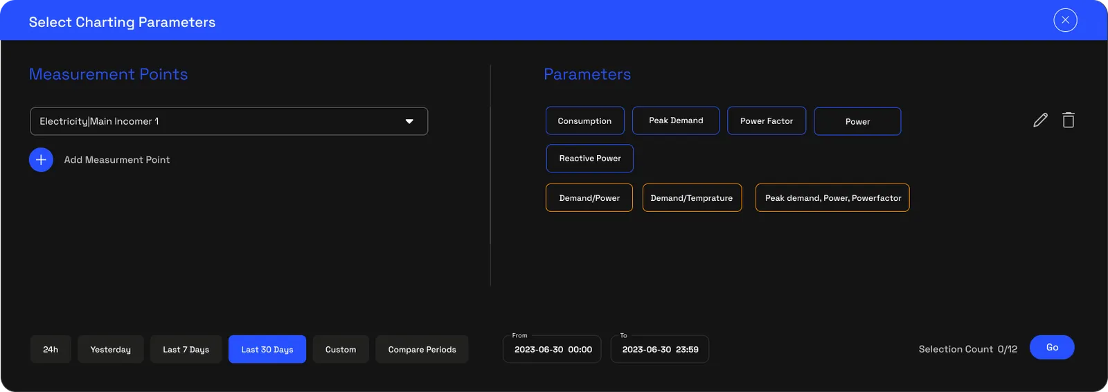
The Select charting parameters modal is where it comes together. On the left you add measurement points, one at a time, from anywhere in your hierarchy; on the right you tick the parameters you want on them, consumption, peak demand, power, power factor, reactive power. If you'd rather not assemble a combination yourself, parameter bundles do it for you, Electrical Health is peak demand, power and power factor together, the three an engineer reaches for first. A counter keeps you to twelve series so the chart stays readable, and nothing loads until you press Go, so there's no rush as you build the selection.
2.2 · Choosing the period
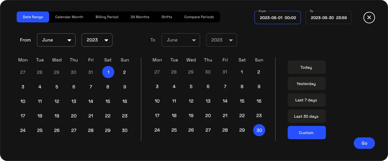
The same modal sets the period: a date range, a calendar month, a billing period, the last 24 months, or a single shift. When you want to compare, Compare periods puts two of them on one chart, so you can hold this March up against last March, or look at the weeks either side of an install.
2.3 · The chart
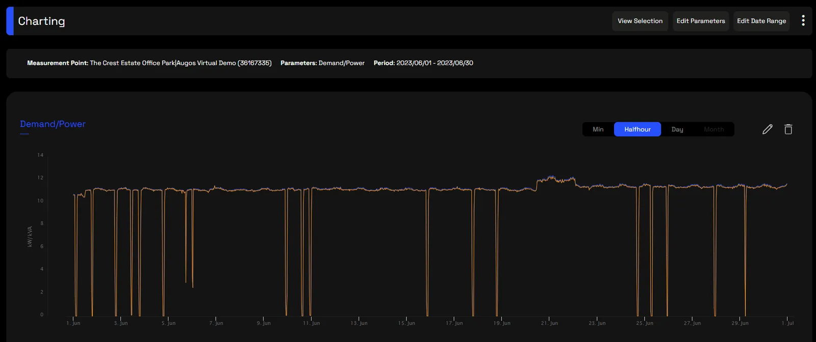
Press Go and the chart draws. The interval tabs switch it between minute, half-hour, day and month, the legend turns individual series on and off, and hovering anywhere reads back the exact value, time and unit. Edit parameters and Edit date range reopen the modal right where you left it.
3 · Use cases
- Prove a correlation. Plot peak demand against ambient temperature and watch them move together, the evidence that hot days are pushing your peak demand up.
- Compare before and after. Overlay the same metric across two periods to show operational drift, or the saving from an install, ready to export for a measurement-and-verification calculation.
- Triage an electrical fault. Plot the Electrical Health bundle across a week at half-hour resolution, and a power-factor dip that only shows on weekday evenings gives you the pattern before a site visit.
- Build a cross-site view. Assemble several sites and metrics over the exact period under review and export the dataset straight into your own tools, with no manual gathering.
4 · Exports
- AI-ready (JSON). The plotted series as a multi-dimensional array, say temperature against power. Feed six months to an AI agent and ask for the correlation and the kW added per degree. More on AI-ready data →
- CSV, Excel & PDF. The rendered dataset, for your own analysis or a report. More on data download →
5 · Good to know
The twelve-series cap is there to keep the chart legible and the export tidy.
One-minute resolution comes in a 30-day window at a time, anywhere across the 24-month history, while the longer intervals cover longer spans. The roll-ups are handled for you, summed for additive metrics like kWh and averaged for instantaneous ones like kW, kVA and power factor.
When you'd rather have a report that frames the data for you, use the others; for a single point and its whole hierarchy, use Technical analysis. Access is scoped by point.
6 · Common questions
Why does the chart wait for the Go button?
So you can finish building a selection before any data is fetched. With several points, parameters and high-resolution data in play, fetching on every change would mean slow, wasted loads.
Why can I only plot 12 parameters at once?
It's the point where the lines stay readable rather than turning into a tangle, and it keeps the query and the resulting export fast and tidy.
Can I compare two time periods on one chart?
Yes. The Compare Periods preset overlays two windows, which is useful for year-on-year benchmarking or showing the before and after of an equipment change.
What's the Electrical Health Bundle?
A ready-made combination of peak demand, power and power factor, the triplet most useful for a quick electrical diagnosis, so you don't have to pick each one by hand.