Tariff comparison
1 · The purpose of this report
Tariff comparison shows whether a different tariff would have cost you less, using your own data. Instead of estimating from an average, it replays your actual last 12 months of consumption against the other tariffs available from your utility, and shows what each would have cost, month by month.
Because only the tariff changes while your usage stays exactly as it was, it isolates one thing: whether the tariff's pricing suits how and when your site actually uses energy.
The comparison stays within your own utility's tariffs, and which ones you're eligible for depends on rules like site type, location, voltage and demand. Most sites come with a standard set of comparatives loaded; Augos can load others on request.
2 · On the page
Pick a site and the page replays its last 12 months against the comparative tariffs: a comparison chart with its tiles, two more charts beneath, then the detailed table.
2.1 · Selectors
| Control | What it does |
|---|---|
| Point selector | Only sites can be selected here, not individual sub-meters. |
| Date | There's no date selector. The page always shows the last 12 months, to cover a full season. |
2.2 · The comparison chart and tiles
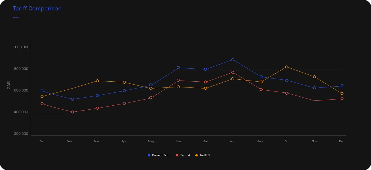
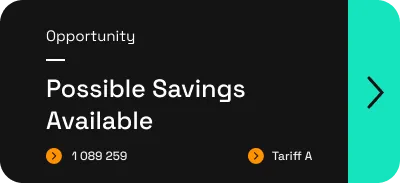
At the top, a line chart plots each tariff's cost month by month across the year, your current tariff against the alternatives, so you can see where one pulls ahead and where the seasons flip the order. Beside it sit three tiles: the first opens the current tariff's full details; the second opens a conversation with an Augos tariff expert, to investigate the tariff or check your measurement accuracy; the third is dynamic, flagging when an alternative would have saved you money and naming it, or telling you there's no saving to be had.

2.3 · Cumulative savings and total cost
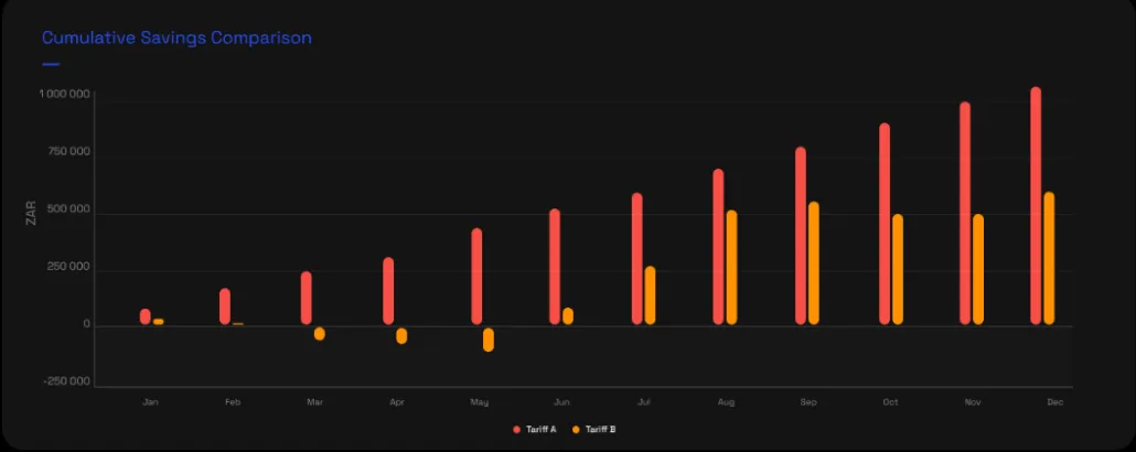
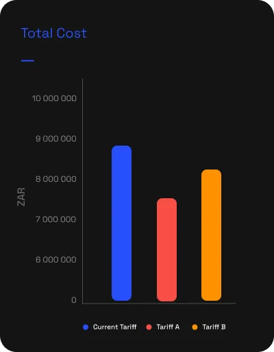
Below the chart, two more size up the decision. Cumulative savings comparison keeps a running total of what each alternative would have saved you against your current tariff: a bar that climbs through the year is money left on the table, one that falls below zero means the alternative would have cost more. The total-cost bars settle it, each tariff's whole-year cost side by side, the cleanest read on which would have been cheapest overall.
2.4 · The comparison table
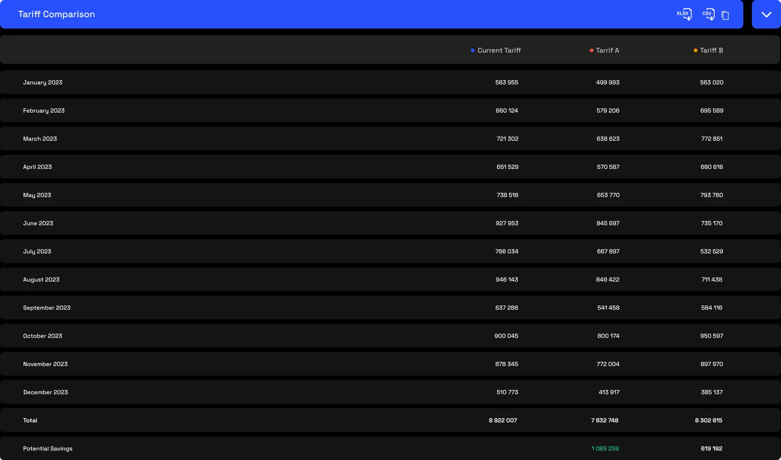
The table is the detail behind the charts: every month's cost under your current tariff and each alternative, a row of annual totals, and a potential-savings row showing what each alternative would have saved over the year. The blue bar exports it to Excel, CSV or the clipboard.
3 · Use cases
There's really one use case, checking your current tariff is still the best fit for how the site runs, and a few situations that prompt it:
- The tariff predates your usage. It was set before you occupied the space, or before a significant operational change, so it may no longer be optimal for what you now draw.
- Demand against block-rate. On a smaller site, comparing a demand-based tariff with a block-rate one to see which fits your profile.
- Time-of-use against flat-rate. Whether a time-of-use structure would beat a flat rate, given when you actually consume.
- Seasonal against non-seasonal. Whether seasonal rates work for or against you, depending on when your heaviest consumption falls.
4 · Exports
- AI-ready (JSON). Each month's cost under the current and target tariffs and the variance, plus the annual net. Hand it to an AI agent with an operational change, say production rising in winter, and ask whether the switch still pays. More on AI-ready data →
- Excel, CSV & Copy table. The comparison table, from the icons in the blue bar. More on data download →
5 · Good to know
The comparison replays your actual interval telemetry, not an average, so it captures your demand profile, time-of-use distribution and seasonal swings, which a simple calculator can't. It stays within your own utility's tariffs and doesn't compare across utilities.
Treat the result as the basis for a conversation, not the final word. Have an Augos representative verify the comparison before you act on a tariff migration; Augos can also handle the migration itself. Access is scoped by point.
6 · Common questions
Does it compare demand charges, or just consumption?
Both. The target tariff is replayed as a complete structure: consumption rates, time-of-use windows, demand charges and fixed charges, against the same underlying telemetry.
How is this better than a tariff calculator?
A calculator multiplies an assumed average by a rate. Tariff comparison replays your actual interval data month by month, picking up time-of-use distribution, demand profile and seasonal variation, so the result reflects how you really use energy.
Can I model next year's tariff increase before it lands?
Once the new tariff is loaded into the platform you can set it as the target and compare. In practice schedules are usually only loaded once formally approved, which is often after the new period has already started.
What period does it look at by default?
12 months, to capture a full season's variation. Longer multi-year windows are supported where you need them.